This blog post will be yet another update on the software behind my homepage, where there have been two new improvements I have yet to write about. First there are presentations, which are much better embedded into the homepage now; second, I worked on on my homepage's statistics section.
Presentations
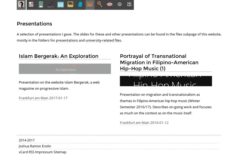
Previously, my homepage featured a presentation section, that was essentially a collection of PDF files. These PDF files were indexed in an XML file.
Unhappy with PDF files, I turned to using reveal.js for my presentations, so that I'd have my presentations in HTML that, if everything else fails, is still readable in text. So far this worked greatly.
Writing my presentations in HTML also offers the advantage that metadata can be easily written into the file and processed by my website just as easily. I had already worked on metatag-based previews and only had to adjust the code slightly to extract metadata from my recent presentations, which I can subsequently use for listing the presentation on my website.
All presentations are stored in one common directory. To list them, I thus only need to scan the directory and extract the respective presentation's metadata from the HTML files.

I added a little twist in pre-processing the presentations before displaying them to embed references. A presentation can have an equally named Bibtex-file, from which references are extracted and formatted in a similar fashion to what I use for blog posts containing references. They are inserted into the presentation by replacing a placeholder (!sources!).
Some Improvements on Statistics
Almost since I started to be more serious about writing my homepage, I have been doing statistics based on what I post. First, I was interested in experimenting with visualization of statistical data. Second, the raw data was out there in the open anyway and I just had to tap into it.
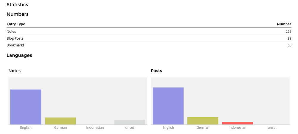
When I rewrote my homepage to get rid of XML, I at first neglected the statistics section, as it is only visible for logged in users anyway. I have now fixed it to use the current data storage format and include additional information like the language of posts.
The visualization is purely done using HTML and CSS. Given this technical background, bar charts were by far the easiest form of visualization to realize. Consequently, all my visualizations were using them for most of the time.
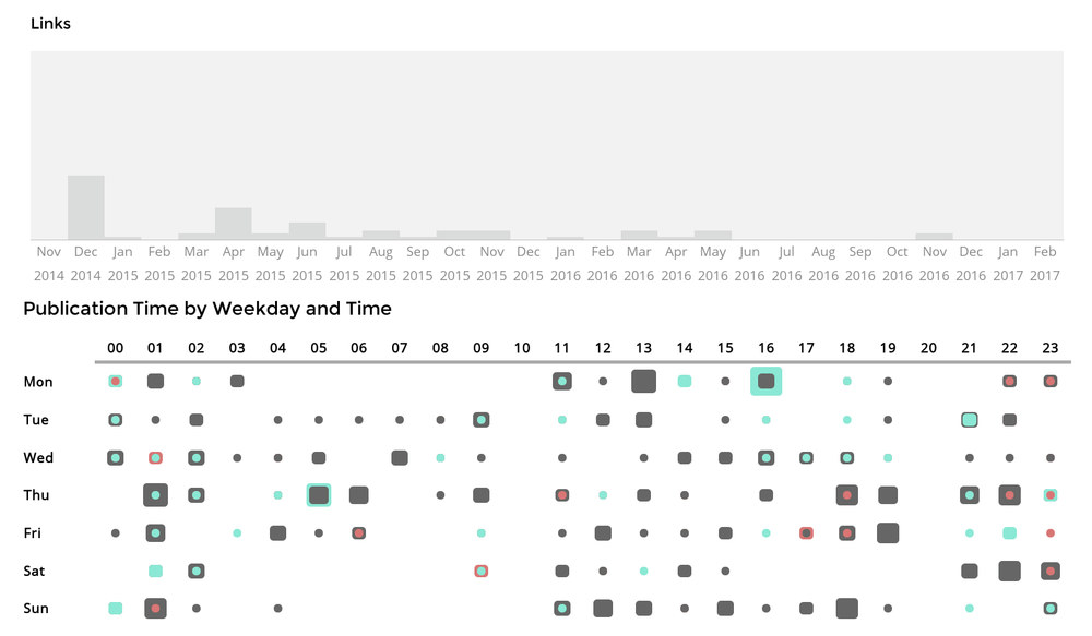
Watching this nice talk from the 33C3 gave me the idea to try out heatmaps as another form of visualization that could be done using HTML and CSS only. Well, after some playing around, I think the results look rather good:
Important in doing the heatmap was to use logarithm functions to flatten the statistics. Initially, I simply computed percentages out of the numbers of posts at a given time. This however either led to times were there was only a single post of a given type to be almost unnoticeable or to those times when I posted many things of the same type to overstep their boundaries. By flattening the numbers, differences in size are still distinguishable while even smaller numbers remains clearly visible.